If Only …
Don’t you sometimes wish you had the job at your State/County Department of Transportation which gave you total responsibility over every road sign posted?
Now before you go off on all the wimpy way-too-slow-for-my-fun-factor conservative speed limits which spoil your day while generating local revenue via Good Driving Awards (aka citations) , let’s agree to move on to something a little less obvious: the posting of warning signs which go beyond the obvious. My home state has plenty of cases where, in addition to the bright yellow double lines painted down the center of the road, there are also additional “No Passing Zone” signs posted, making us wonder (hope?) if in the signs’ absence it might be OK to sneak in just a little pass. (Wrong!)
We’ve all seen somewhat redundant “RR Crossing” signs posted where there are black and white crossing gates, flashing lights, elevated railroad tracks, and several other indicators we’re approaching a live railroad crossing. I’ve recently noticed in an adjacent county there are several “Hill Blocks View” and “Curve Hides View” yellow signs posted just before a blind hillcrest or blind curve…when in actuality any driver who still has a pulse should recognize that he can’t see over the next hill with no need of a sign to point it out. And – often as not – the very next blind curve has no such warning. Go figure.
But let’s move beyond the superfluous, and look at some instances in which some additional or more enlightened signage would actually be of benefit.
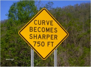
The above example was so rare I stopped and went back for a photo. Wouldn’t it be wonderful if the highway department appeared to recognize the danger inherent in decreasing radius curves, which spiral in like a chambered nautilus and suck you in at a speed way faster than you can eventually negotiate? It’s not like some engineer who designed or supervised building of the road wasn’t aware the curve tightened up. I suspect the failure occurs at the cubicle level, where generic signs are purchased by the gross, but then I’ve grown a tad cynical.
So, how’s this for an idea for a little fun? Send us your best examples of the most redundant/least useful signs you’ve seen, and also share with us any glimmers of brilliance where the sign goes above and beyond the call of duty.
Or is just plain silly, (such as the following example). PT

